
SAD buster...
I have a friend who suffers from SAD so badly that she moved from Chicago to the sunny confines of Miami Florida. Right about this time every year, as I look at the gray skies and muddy landscape around me, I think of her and wonder if I shouldn’t do the same thing.
SAD is the seasonal affective disorder that’s also known as the winter blues—or in extreme cases—winter depression. Some say it’s treatable with light therapy but I prefer to self-medicate with my own brand of color therapy. Call me whacky, but my particular pseudoscientific practice involves playing with lots of fabulous fabric in deep soulful saturated colors.
First, I begin with the big dig.
Here’s where collecting fabric—be it scraps from other projects or piles of fat quarters really comes in handy. And if you happen to own a quilt shop—better still. I have lots of the ends of bolts to toss into the mix. I don’t consider myself a pack rat for saving this stuff—and you shouldn’t either. Instead we’re like those poor little squirrels that need to store up lots of nuts for the long winter months. This is really about basic human survival. Right? Right!
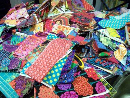
Next, I start making little mini-piles. I put “like” fabrics together. Things I think will play well with one another. I’ve organized by color and genre so I might have a pile of reds, blues and greens to build color palettes and then things like 1930s repros and batiks for specific projects TBD at a future date. But my favorite pile—the one calling my name—is the SAD busting Kaffe Fassett fabric!
I’m posting a picture of the Kaffe pile so you too can eyeball the beauty of it.
Now, breathe in…breathe out. Repeat as often as necessary until you feel a sense of calm come over you.
One of my favorite Kaffe quilts is his 16-patch—quite simply a 4-patch x 4. He’s used this pattern in lots of his books starting with Glorious Color many years ago before he had his own collection of prints. In his latest book Quilts En Provence he’s created two versions—one with a low contrast pastel palette and the other in his signature high contrast jewel tones. Guess which one I like the best?
I’ve started making my blocks. Since these finish at 10”, I’m planning to do 7 blocks across by 9 rows down, for a total of 63 blocks. I’m using 3” strips to piece the 16 patch blocks. And I’ve discovered that two strip sets will yield 3 full blocks. This means that 63 blocks divided by 3—that equals 21 strip set combinations—for a total of 42 fabrics.
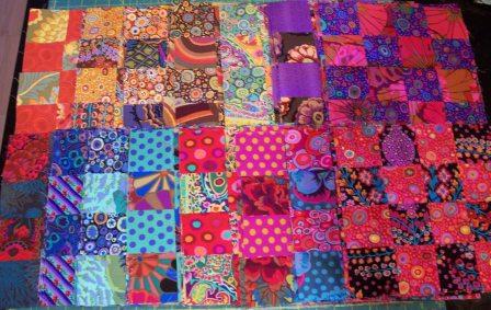 I’ve used high contrast combinations with warm and cool colors to achieve the big visual “POP.” Typically I start with a big print focus fabric and then pull a secondary color from that for the second fabric so that the colors speak to one another. I also avoided duplicating fabrics so there’s lots of visual variety.
As of this post, I’ve got 45 blocks done with 18 more to go.
Hopefully I’ll be pulling out the design wall this weekend and laying out the top.
Stay tuned…ccc
 Quiltology
 Post a Comment
 1 Reference
References (1)
-
 Response: the therapy place
Reader Comments